" height="34px" id="we4GWAbXa" width="34px"/></svg>)
Bike Share App Redesign
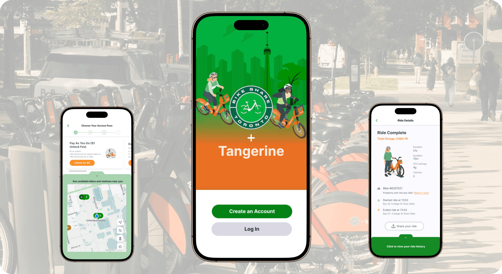
Designing Trust Into Every Ride
Bike Share Toronto is the official and only app available for accessing Toronto’s shared bikes, but its core flows created friction for both new and returning users. Our challenges included simulating hardware-dependent states without live bikes, clarifying misleading labels, preserving the original visual style while improving usability, and fixing weak cost/status feedback under tight timelines. In final testing, the prototype achieved 95.3% overall task success, with about 1 to 2 minutes to onboard and about 40 seconds from return to cost confirmation, demonstrating a faster and more trustworthy path from first tap to first ride.
Problem
New riders get lost, returning riders feel unsure
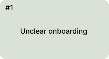
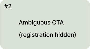
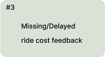
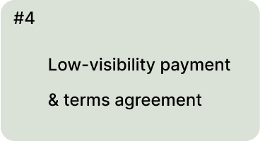
First-time riders struggled with unclear onboarding, hidden registration paths, and overlooked payment agreements. Returning users often missed ride cost details and lacked timely feedback after completing trips. These issues led to confusion, reduced confidence, and increased likelihood of drop-offs at the most critical moments of the rental journey.
Solution
Redesign
two primary user flows
New user onboarding
Returning user riding
Improve usability of the rental process for new and returning users. Enhance clarity, feedback, and guidance within the app interface.
Accurately identifying existing usability issues
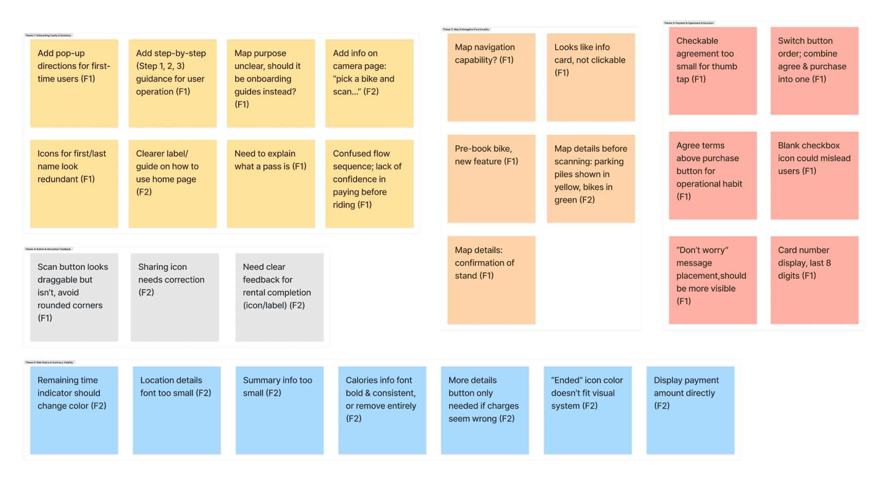
We began with a heuristic evaluation to uncover usability gaps in the Bike Share Toronto app, focusing on onboarding and ride completion flows. This expert review identified issues such as hidden registration, ambiguous “Choose a Pass” labels, and missing error feedback.
We conducted in-person usability testing with participants recruited from our networks. We combined think-aloud protocols with silent observation, and collected both quantitative metrics (Single Ease Question, System Usability Scale) and qualitative insights from post-task interviews.
Key Findings
Ideation
User Stories
These stories captured the needs of both new and returning riders. We prioritized stories that addressed the most critical usability gaps, so that our design decisions stayed aligned with user pain points rather than assumptions.
User Flows
Based on the user stories, we mapped two core user flows: onboarding with pass purchase and the unlock–ride–return cycle. By visualizing each step, we identified where users hesitated, missed feedback, or dropped off.
User Flow 1 - Create Account and Begin Rental
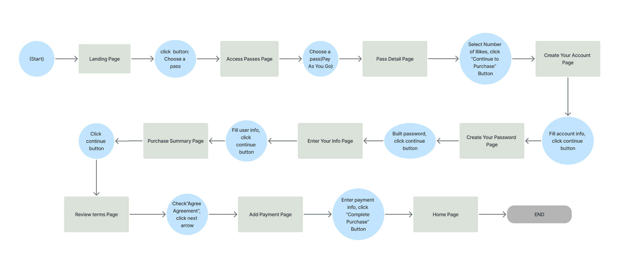
Original user flow

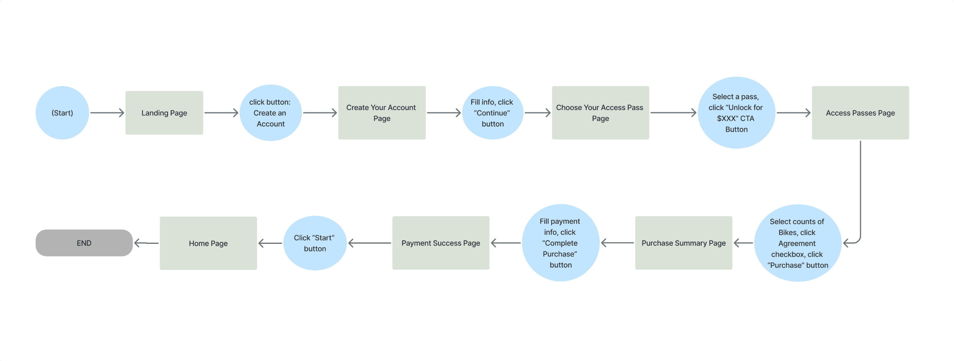
New user flow
User Flow 2 - Unlock, Ride, and Return a Bike

Design
Mid-fidelity Wireframes
We developed mid-fidelity wireframes to quickly visualize the redesigned user flows and validate key improvements with users before investing in high-fidelity design. Testing these wireframes revealed where onboarding steps were still unclear, where CTAs needed stronger visibility, and where cost feedback required greater prominence. These insights directly informed our iterations, ensuring that the final redesign solved the most critical usability issues and provided a smoother, more trustworthy rental experience.
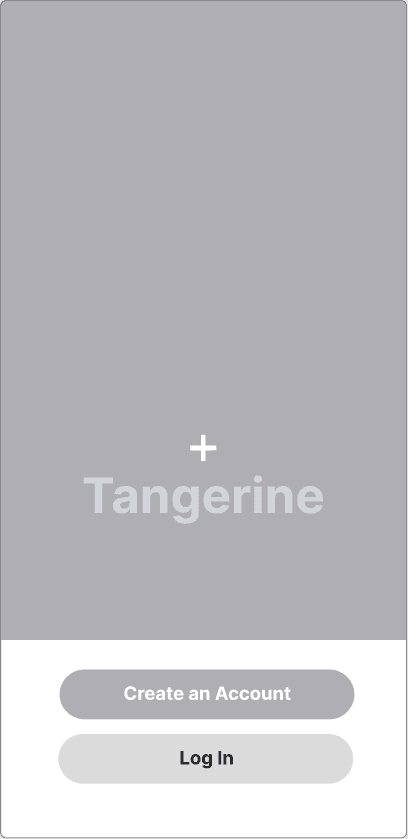
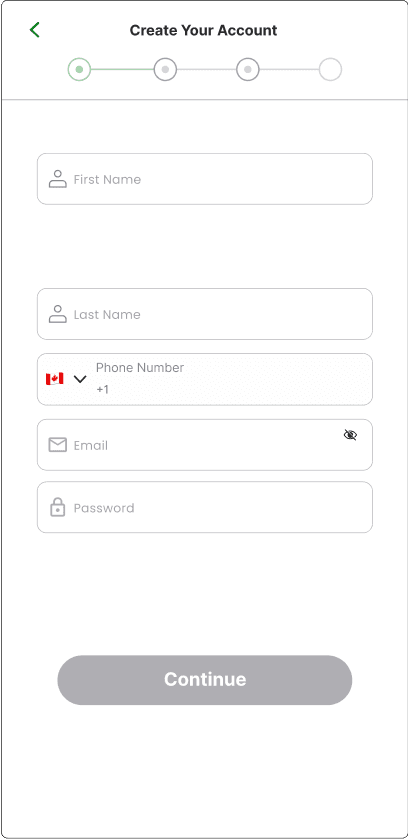
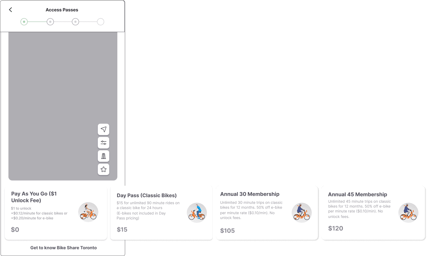
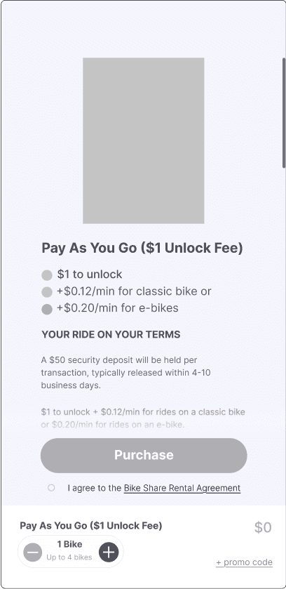
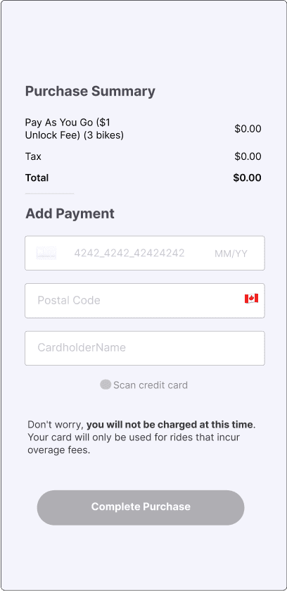
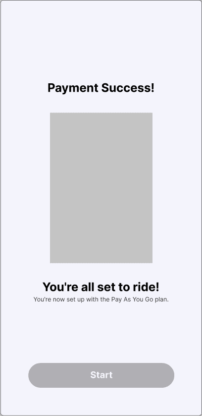
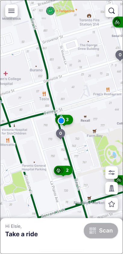
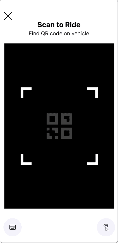
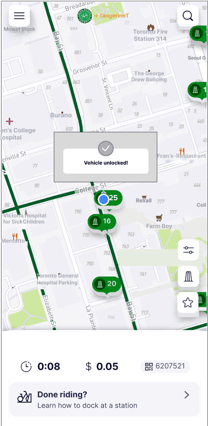
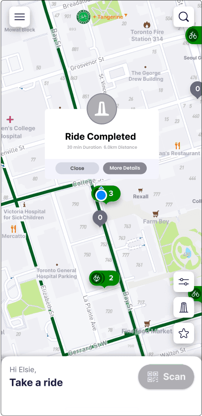
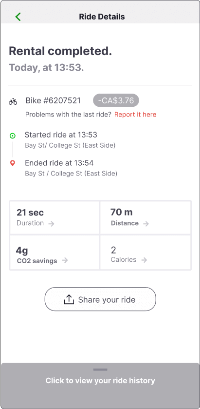
We kept the original UI style to preserve brand consistency and user familiarity, while applying targeted usability optimizations. This balance between visual continuity and functional improvement ensured that users experienced the app as both familiar and significantly more intuitive.
Test & Iteration
In-person Usability Tests
Through a combination of think-aloud sessions, task observations, and post-test interviews, we identified moments of hesitation and confusion that still disrupted the rental process. The final prototype achieved an 89.3% task success rate, validating that our iterative, user-centered approach effectively improved clarity, confidence, and overall usability.
What We’ve Changed?
In user flow 1, we:
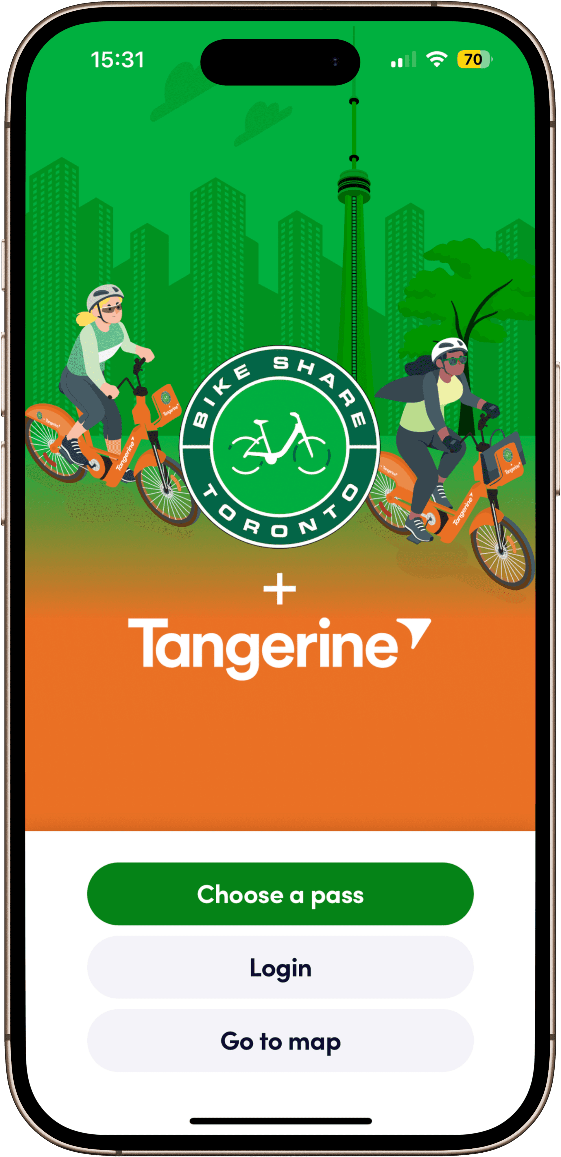
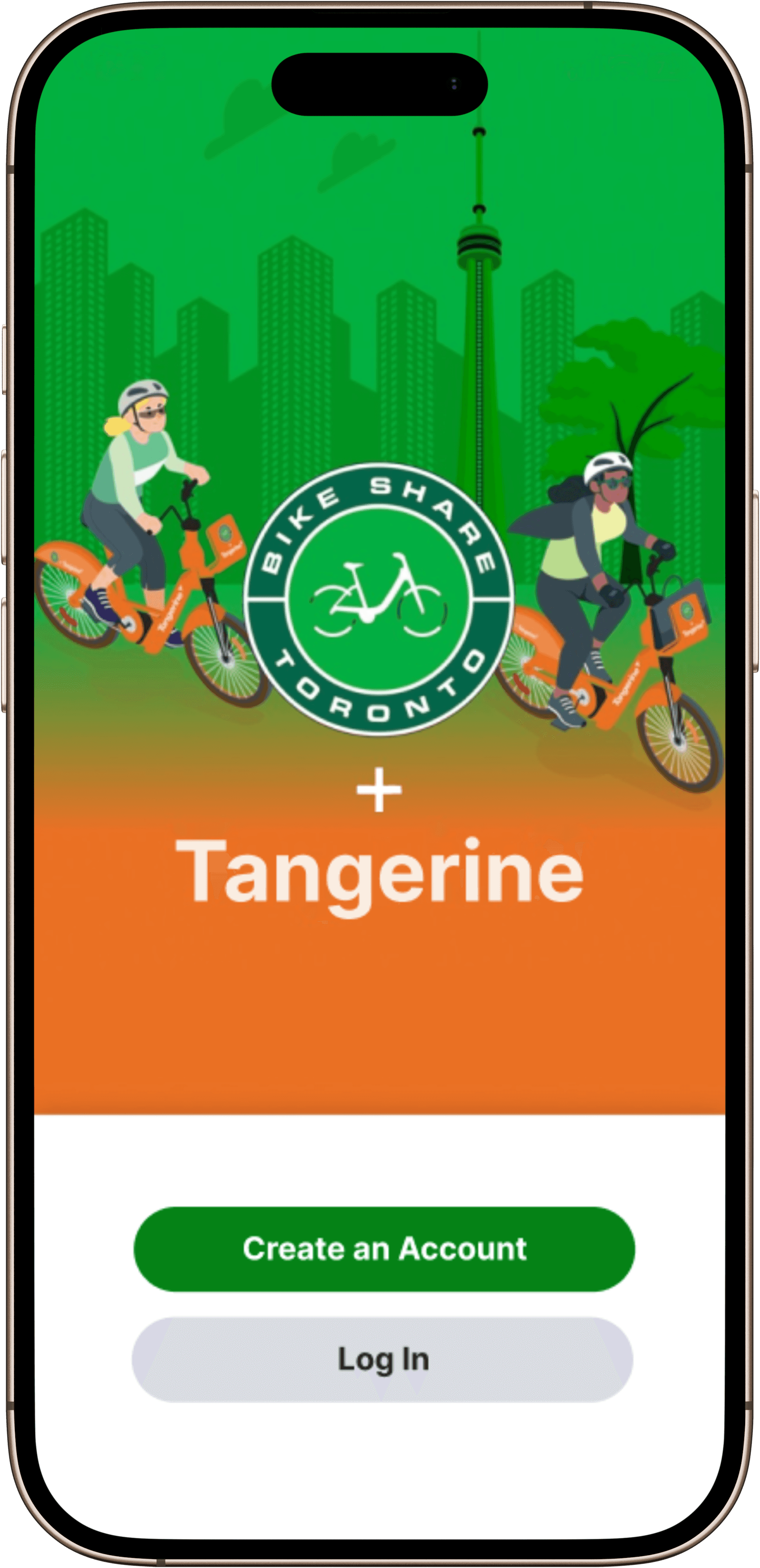
Simplified landing page
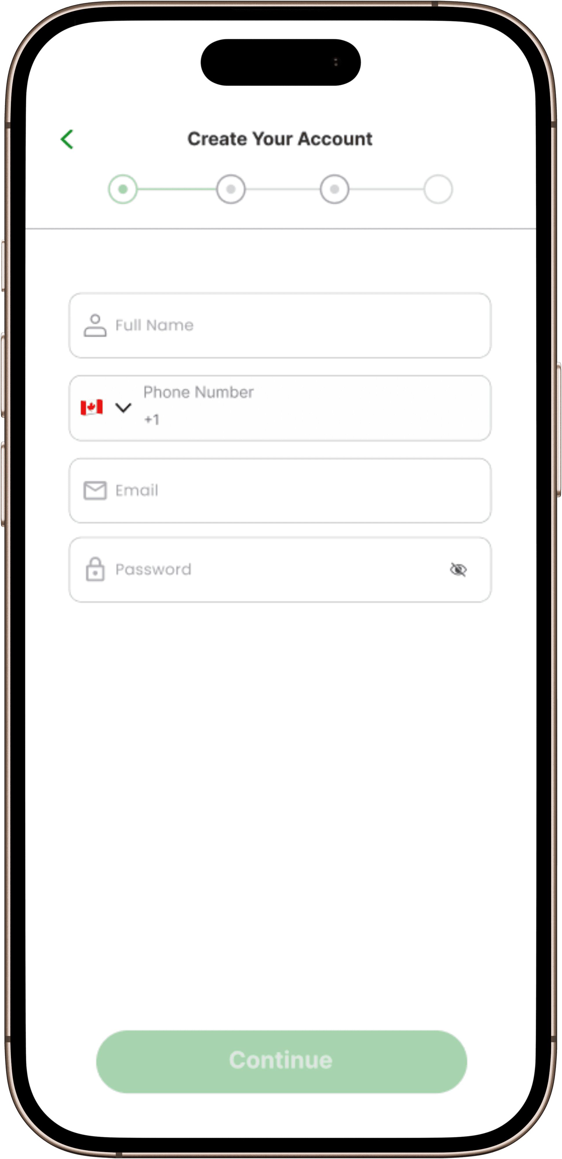
Redesigned account form
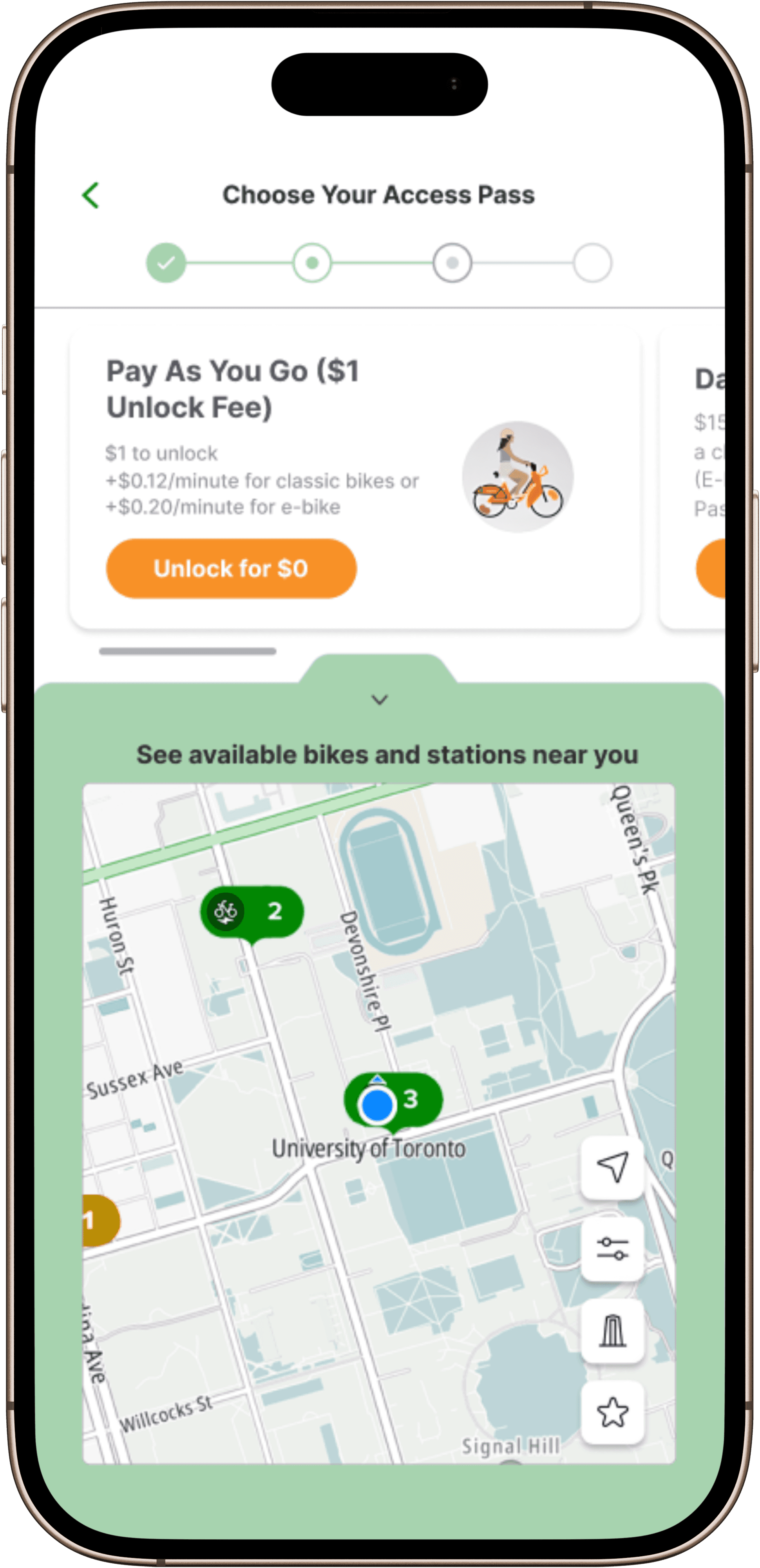
Switched to horizontal cards
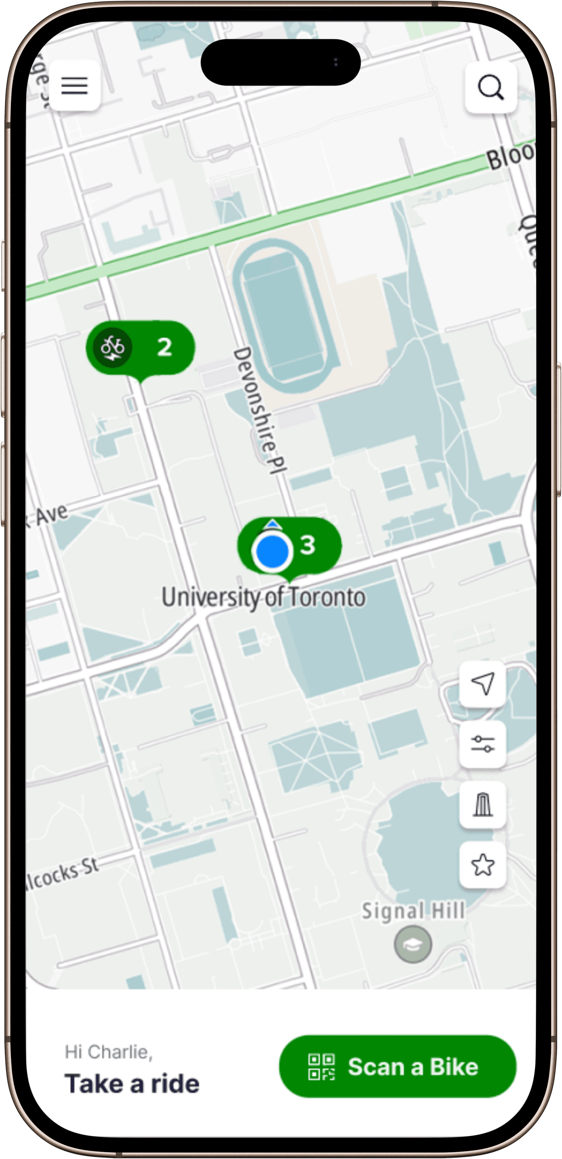
Added live bike map
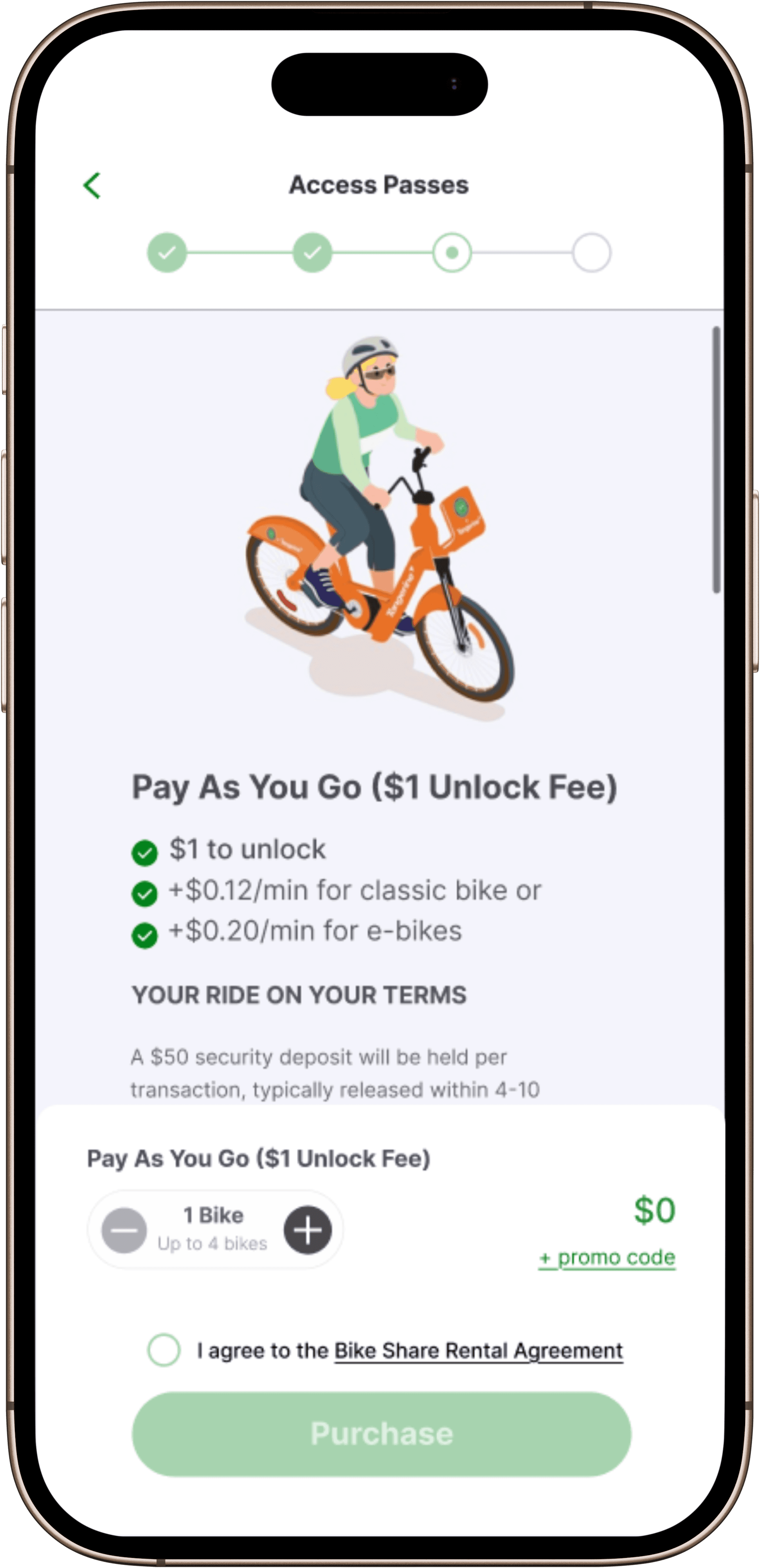
Required terms agreement
Moved checkbox upward
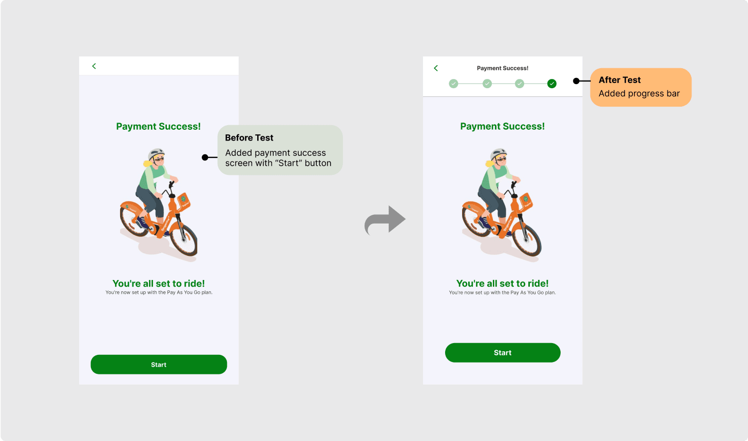
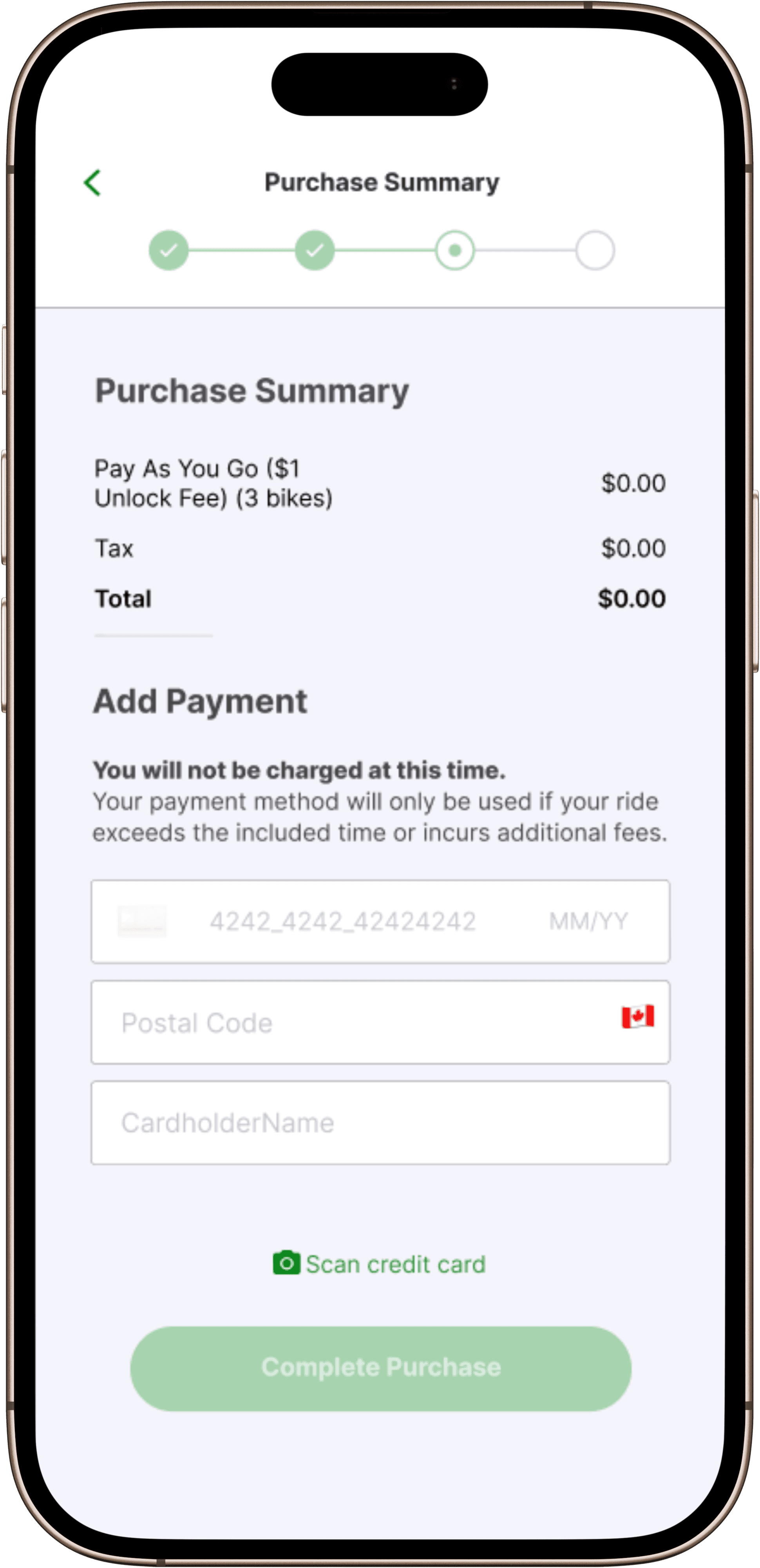
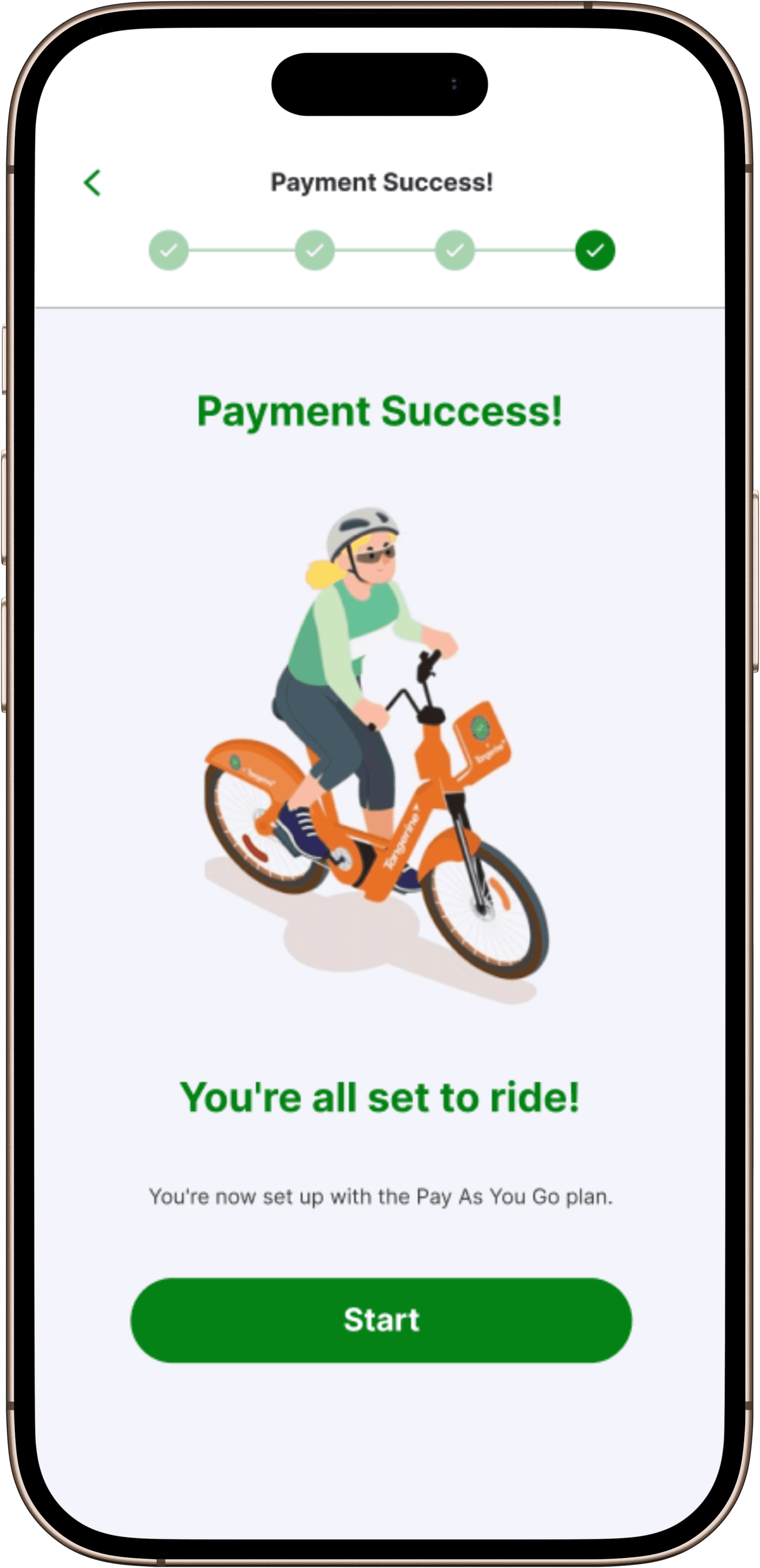
Added payment success screen
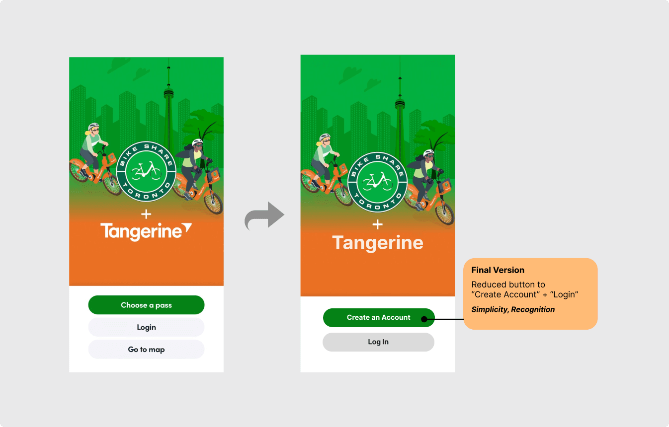
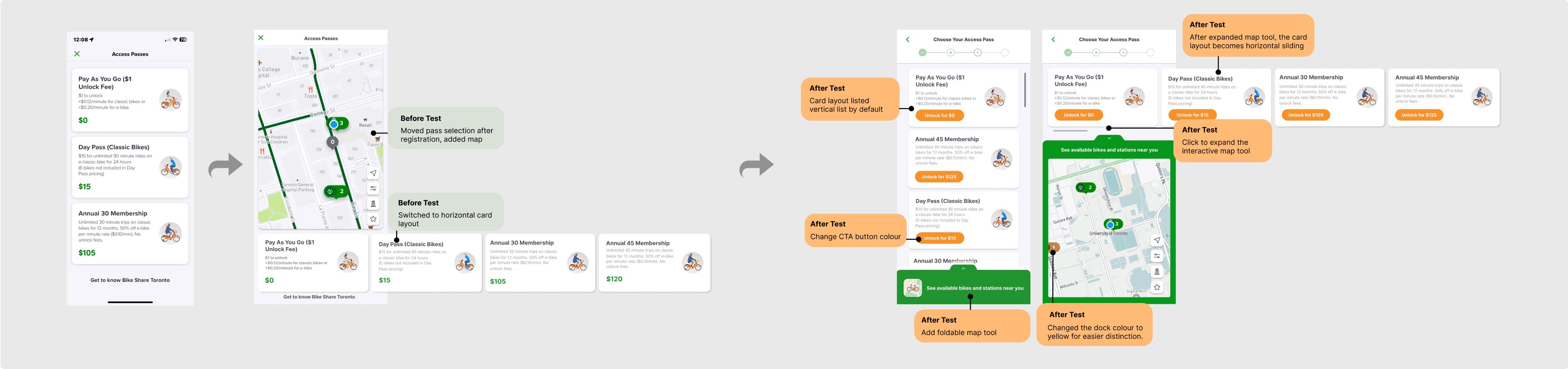
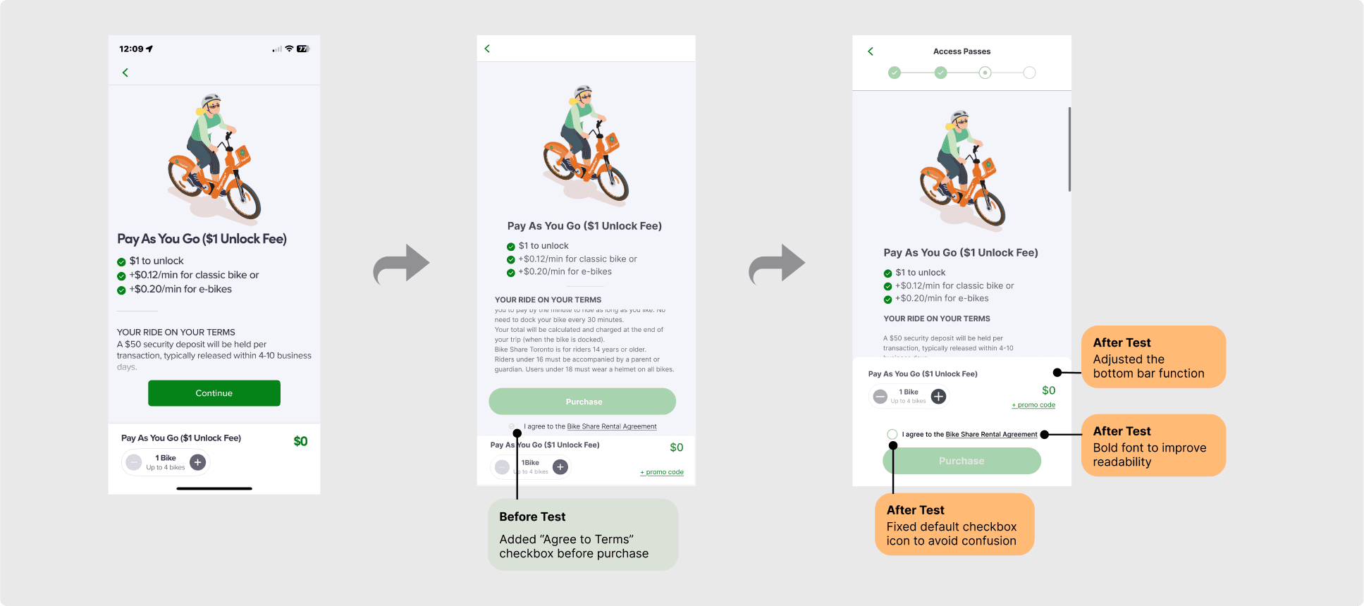
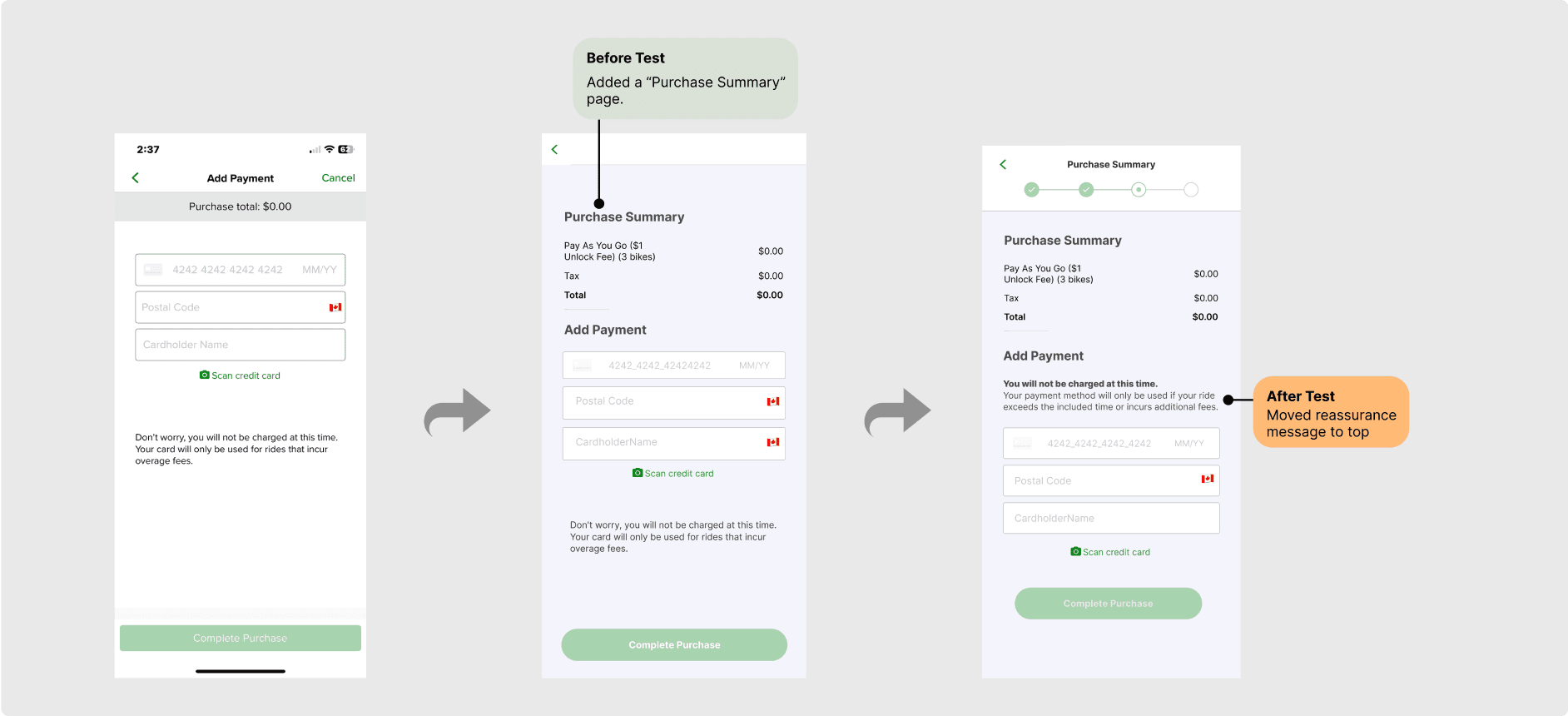
In user flow 2, we:
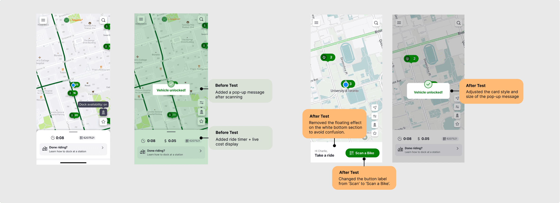
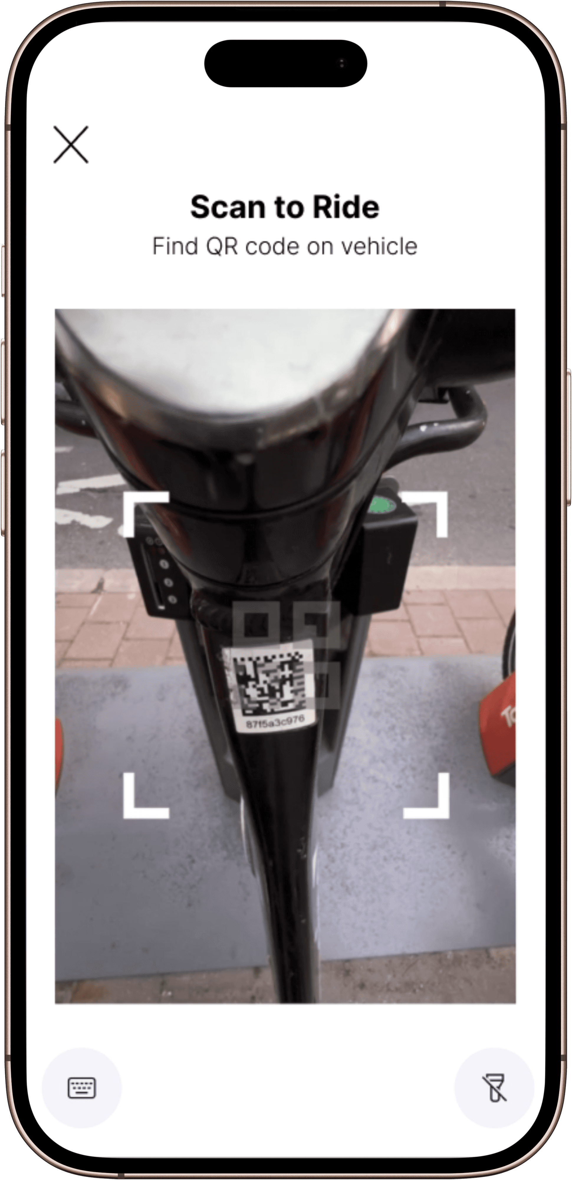
Added unlock confirmation
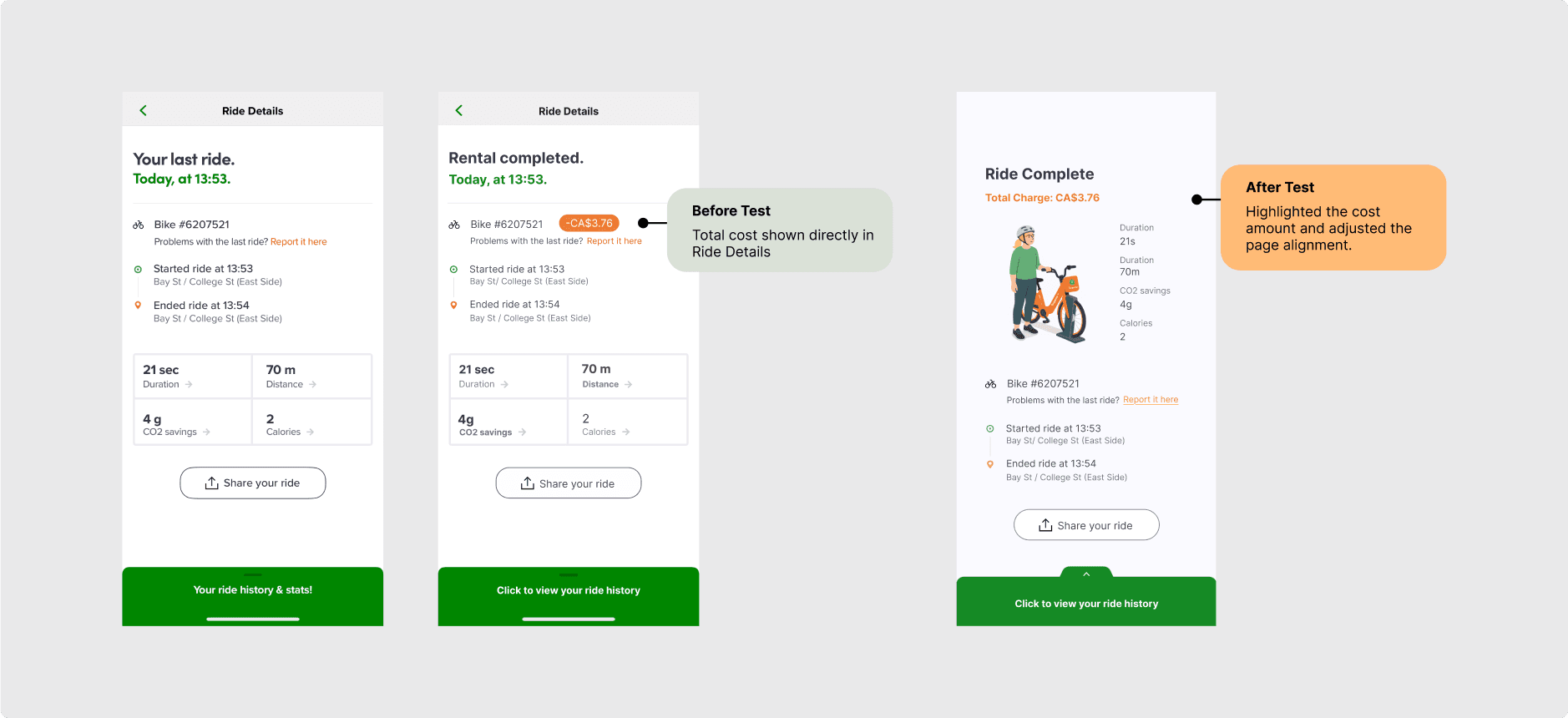
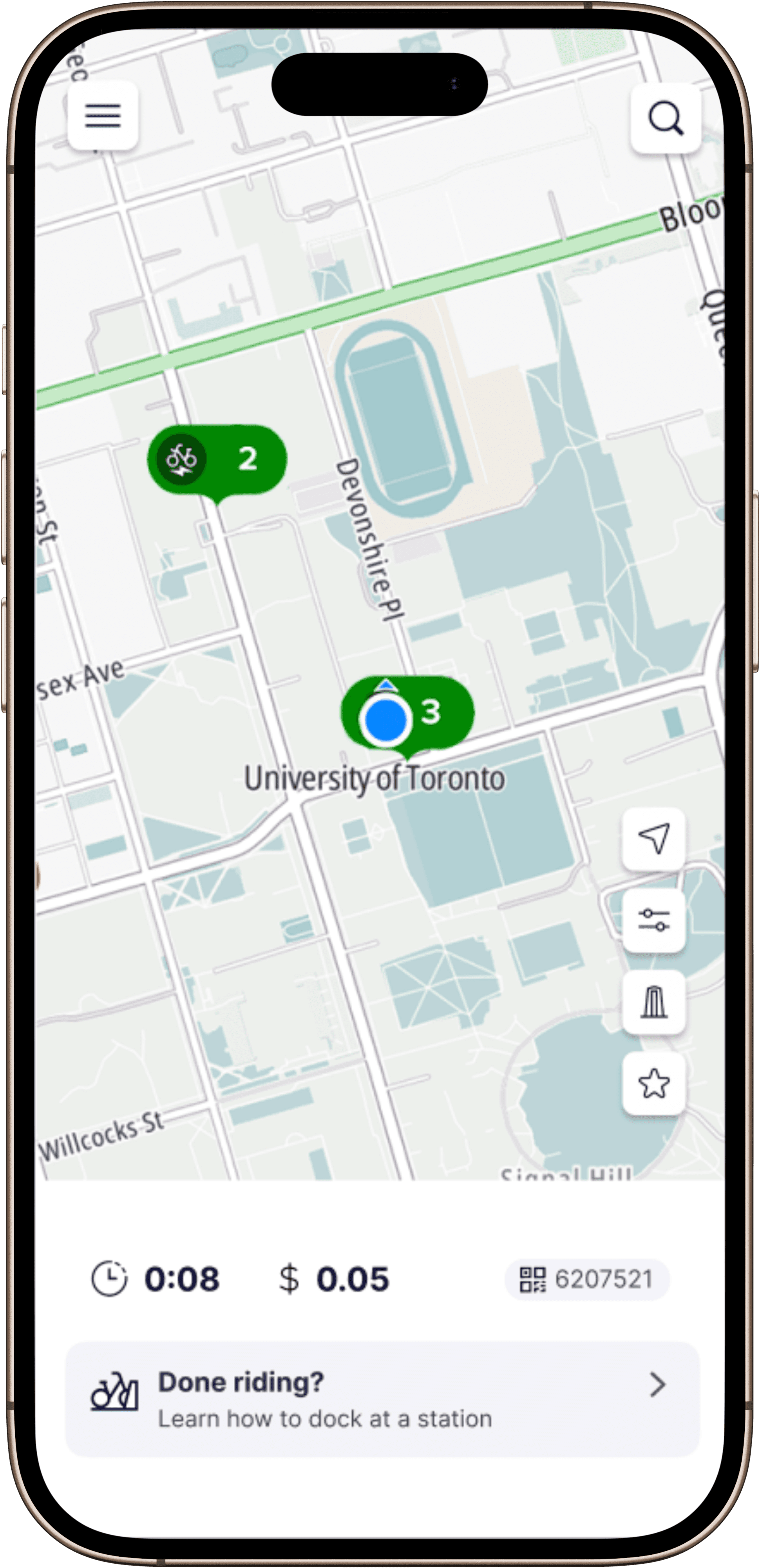
Displayed ride timer and cost
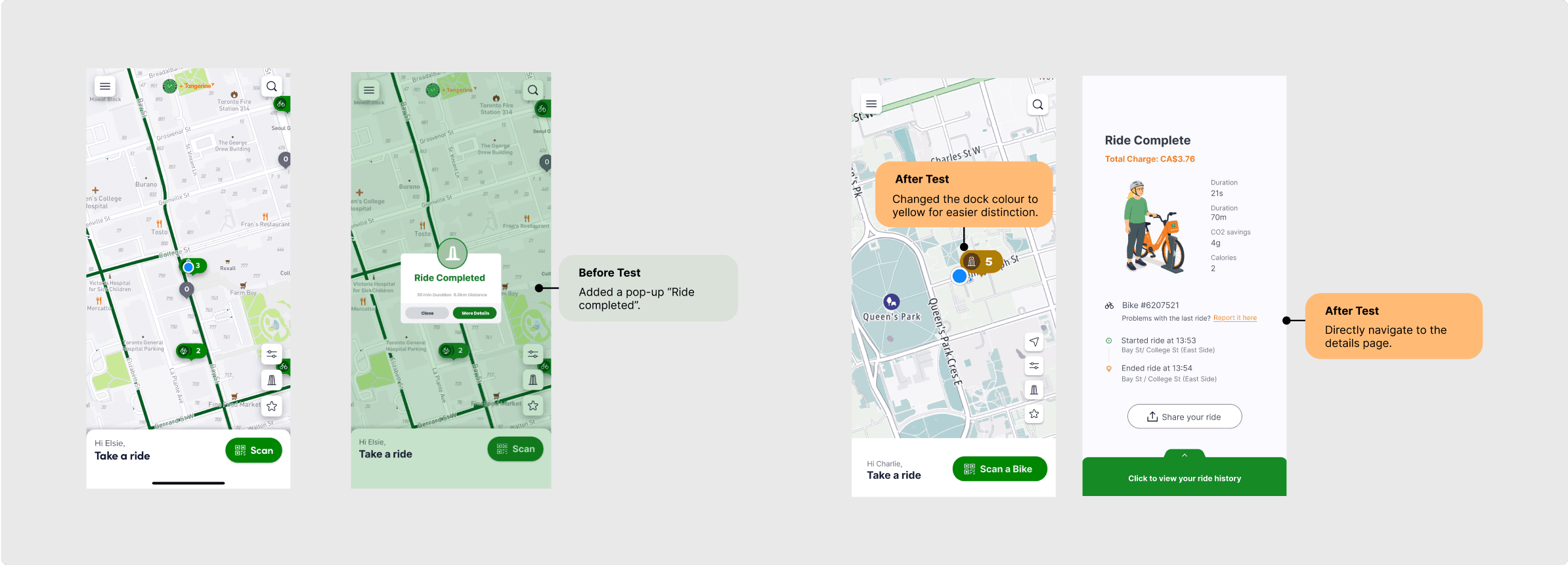
Updated button labels and colors
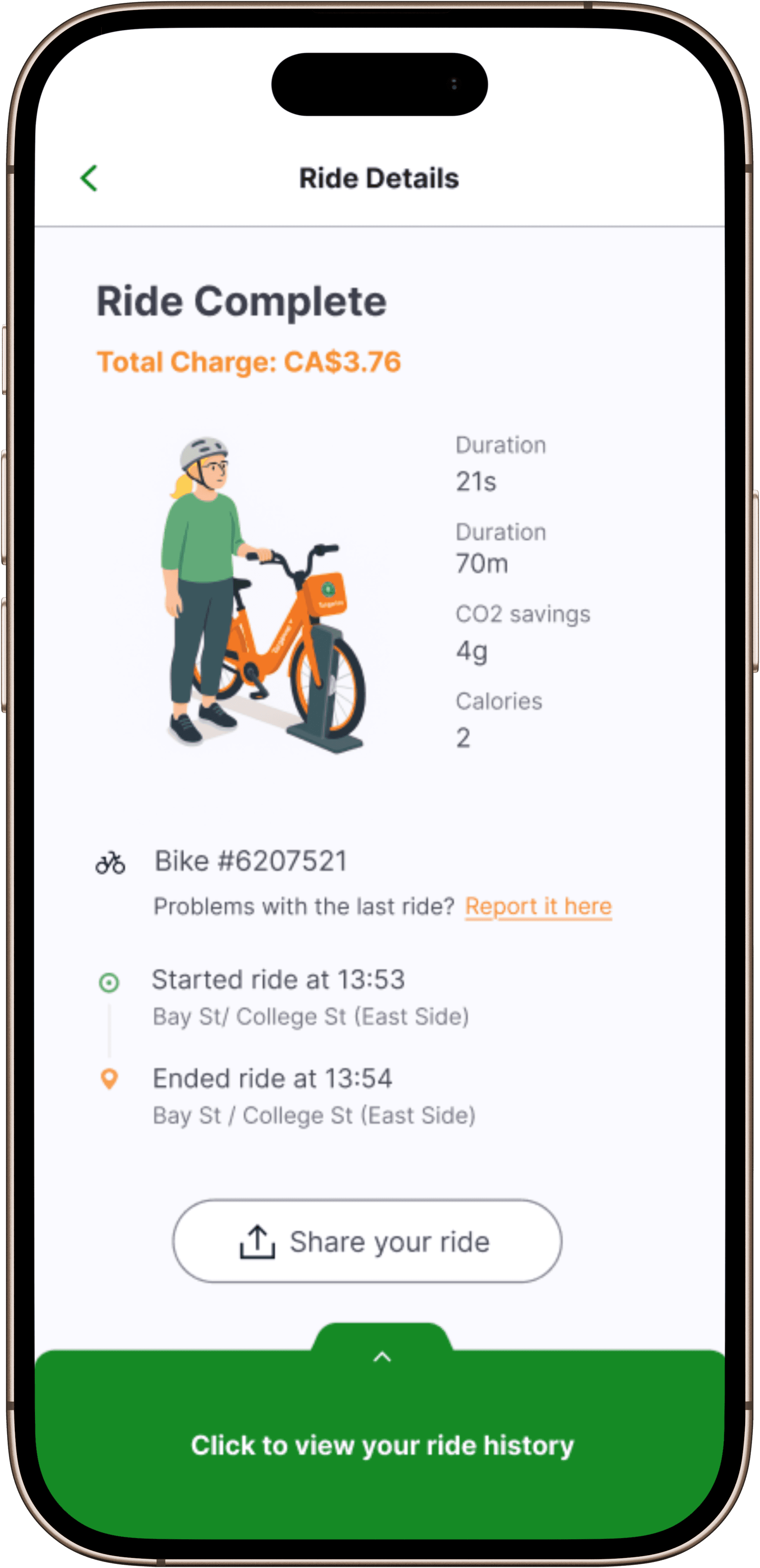
Redirected to detailed summary
High-fidelity Prototype view
After multiple rounds of testing and iteration, we translated the validated wireframes into a high-fidelity prototype that reflects both functional clarity and visual consistency. The design preserves Bike Share Toronto’s original color palette and typography while integrating improved layouts, clearer CTAs, and stronger feedback cues. Every screen was refined based on real user insights—ensuring that the final experience feels both familiar and significantly more intuitive, guiding users from onboarding to ride completion with confidence and ease.
Reflection
What I Learned
Usability testing was the turning point of this project. It transformed our redesign from assumption-driven to evidence-based, showing me how small interaction details can make or break the user experience.
Language Matters
Language itself can mislead. A simple label like ‘Choose a Pass’ caused users to miss the registration path entirely, reminding me that clear wording is as critical to usability as layout or flow.
Constant Iteration
The test results pushed us to refine progress indicators, enlarge the terms checkbox, and auto-redirect to ride summaries. These weren’t cosmetic tweaks; they directly improved task success and confidence. Iteration became less about perfection and more about responsiveness to real user needs.
©Elsie Dong