" height="34px" id="we4GWAbXa" width="34px"/></svg>)
MeetSphere
A campus app connecting students through events
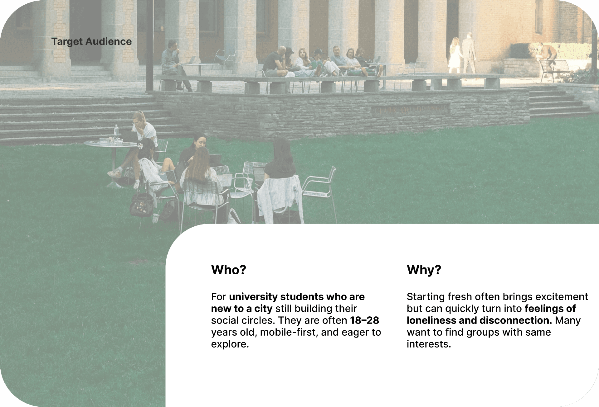
MeetSphere is designed for university students navigating life in a new environment. As one of the product designers, I contributed from early concept to prototype. The challenge was to craft an intuitive experience that surfaces relevant activities and fosters meaningful connections—reducing loneliness and speeding up integration into campus life.
Problem Statement
Understanding the Needs of Newcomer University Students
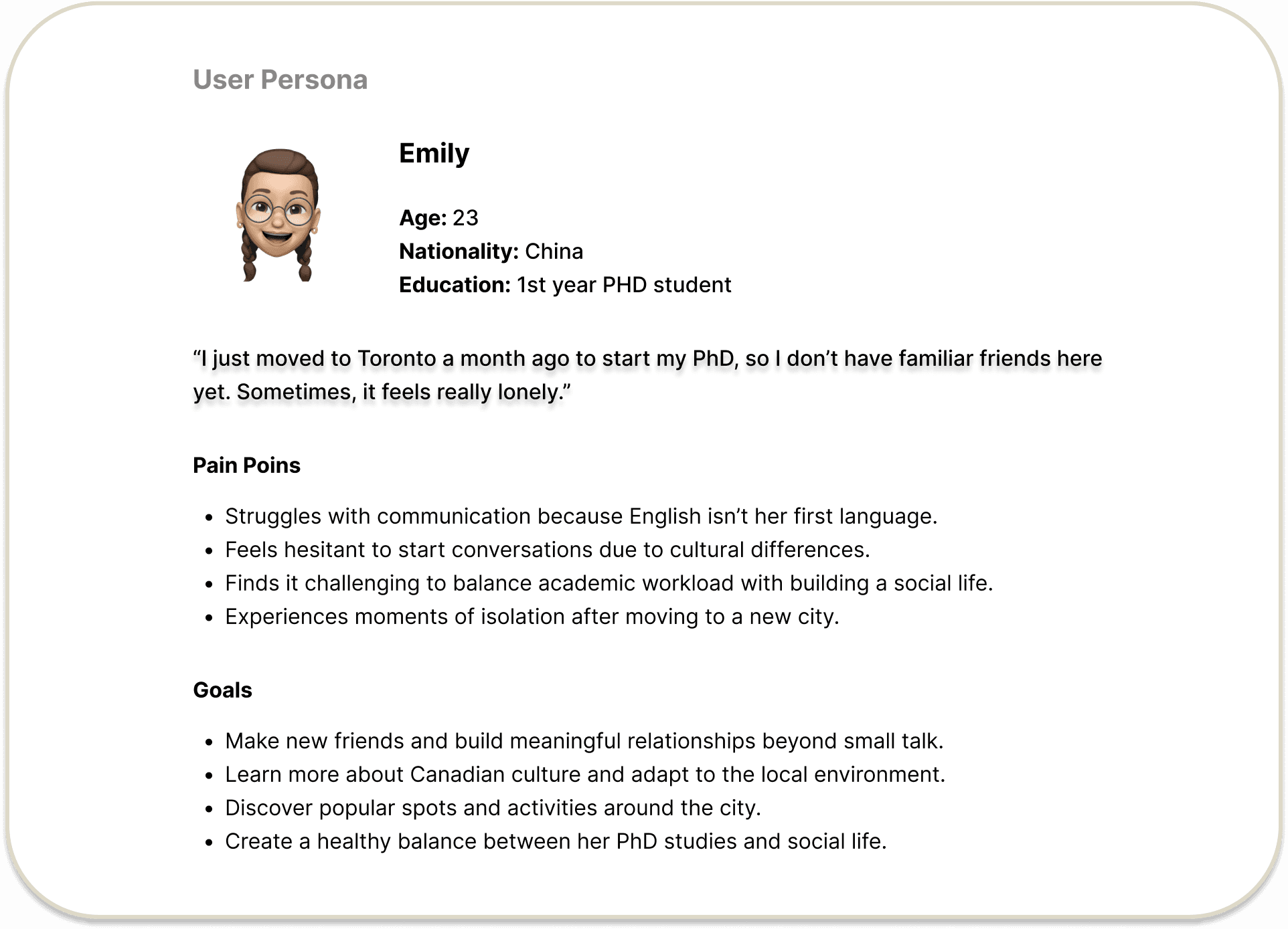
When university students settle into a new environment, they step into a world of unfamiliar faces and places—full of promise but threaded with uncertainty. The early excitement can quickly give way to a quieter loneliness when it’s hard to find a foothold. They crave connection, yet often aren’t sure what the first step should be.

Solution
A campus discovery app that quickly matches students with the right groups base on their interests
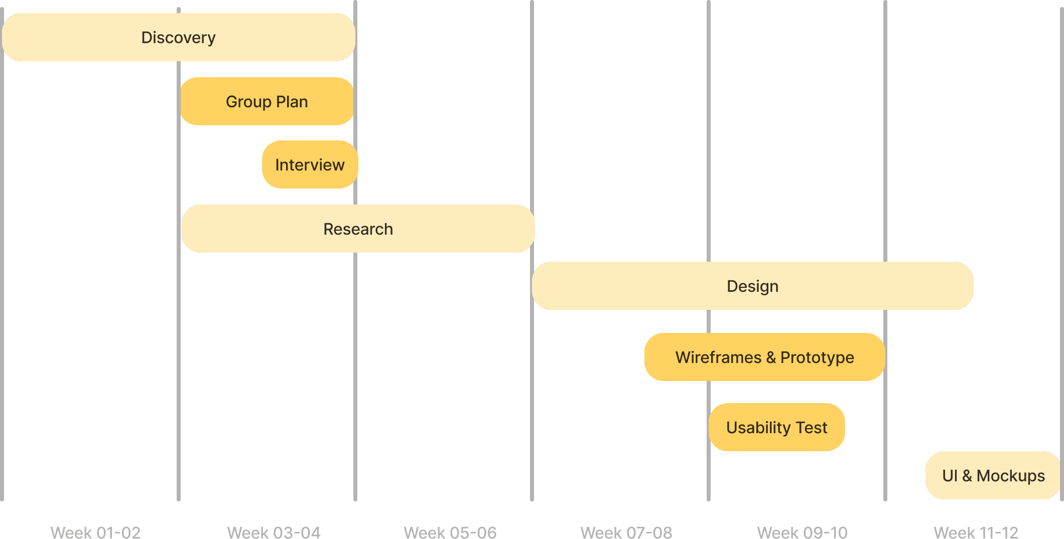
Timeline & Scope of Work
Research

Interview Questions
For Quantitative Research
Are you an outgoing person? Or do you like to stay indoors?
Have you attended any networking events?
How do you feel about moving to Toronto?
How are you adjusting to this new place? Did you have any troubles related to meeting new people?
Have you tried to socialize with new people? (Did you have time to do that with all the work)
Are you seeking friends from similar backgrounds or making local friends?
Have you attended any networking events? How was your experience?
Are you comfortable in breaking the ice or do you need someone else to initiate?
Are you open to talking with people on social networking sites?
In what situations do you feel the need for a friend group the most?
Insights
Cultural Barriers Can Lead to Social Isolation and Psychological Problems
Sources from academic journals, scholarly articles, reddit, interviews.
Ideation
Designing for Connection
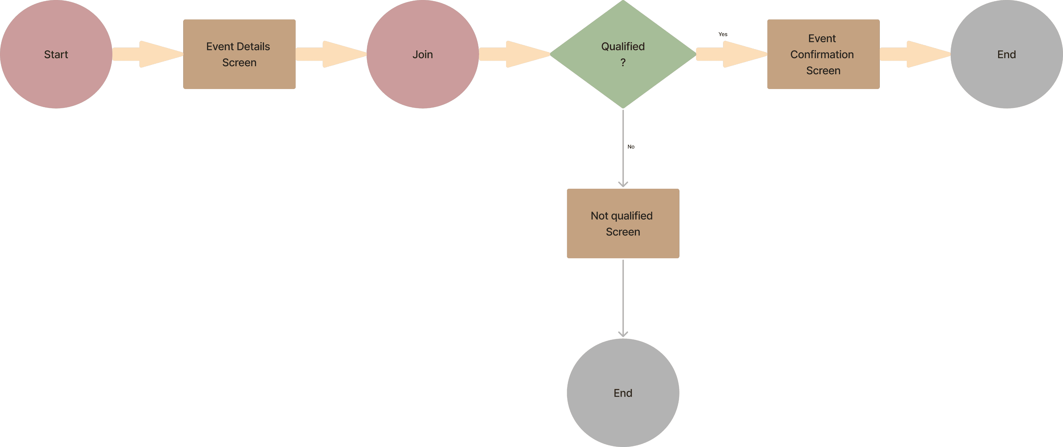
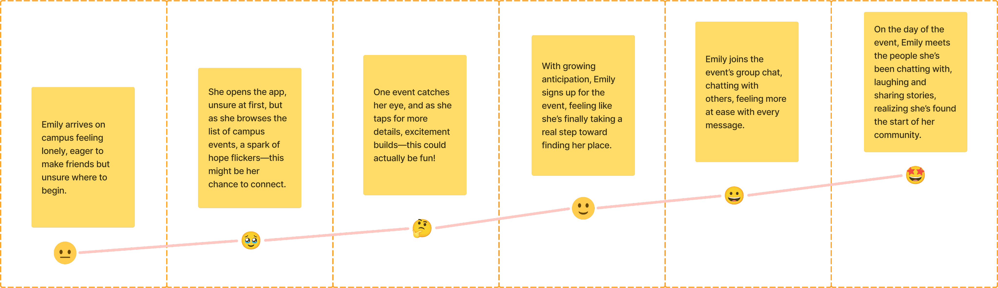
We reframed ideas around one question: what reduces loneliness fastest? We ran a focused Brainstorm, then Prioritized concepts by evidence of need and effort-to-impact. From there, we mapped a Happy Flow for a newcomer’s first successful meetup and expanded it into a To-Be Journey Map that clarified moments of uncertainty, system handoffs, and success metrics. This aligned the team on which core features to prototype first.

Design
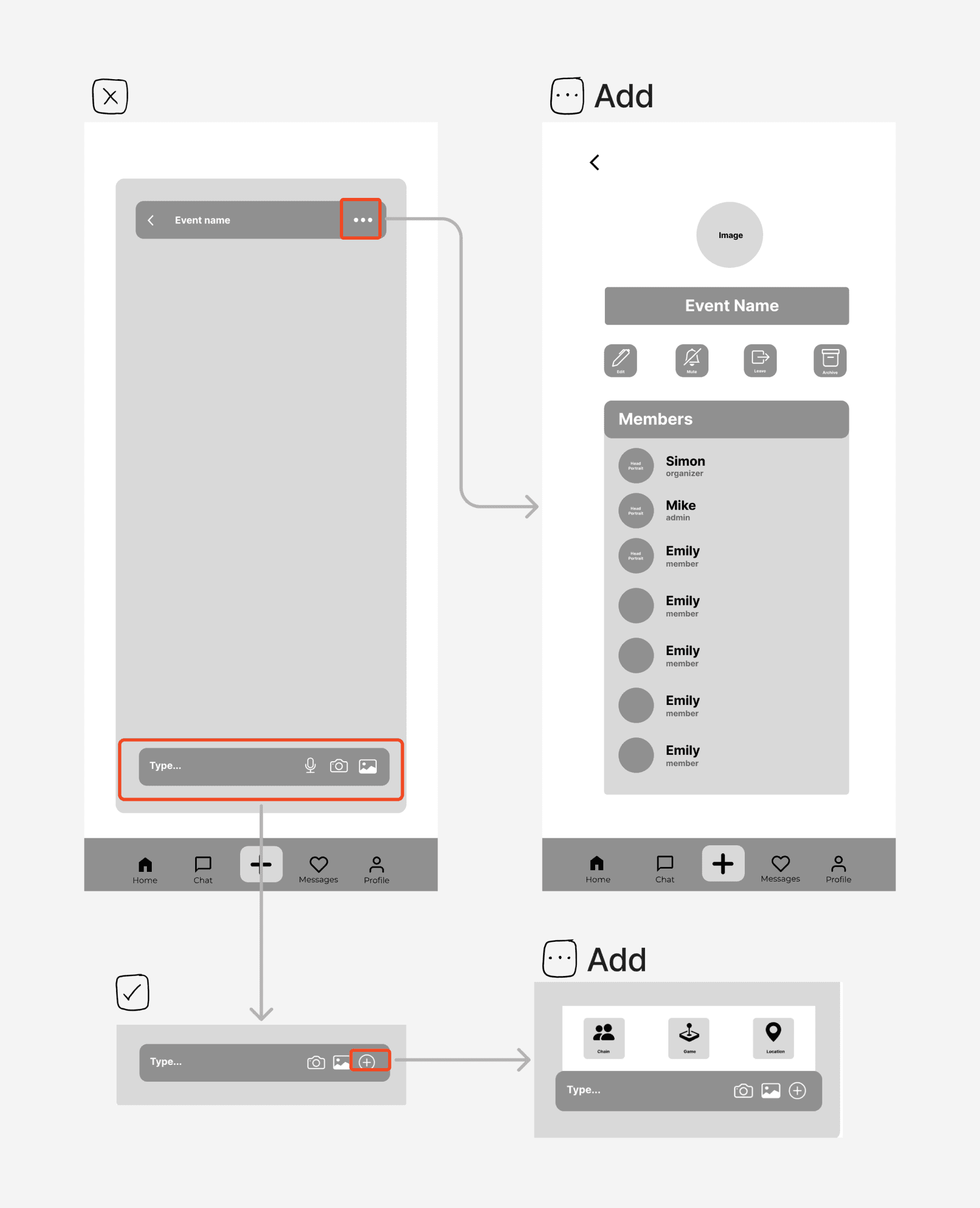
Sketching & Low-Fidelity Wireframes
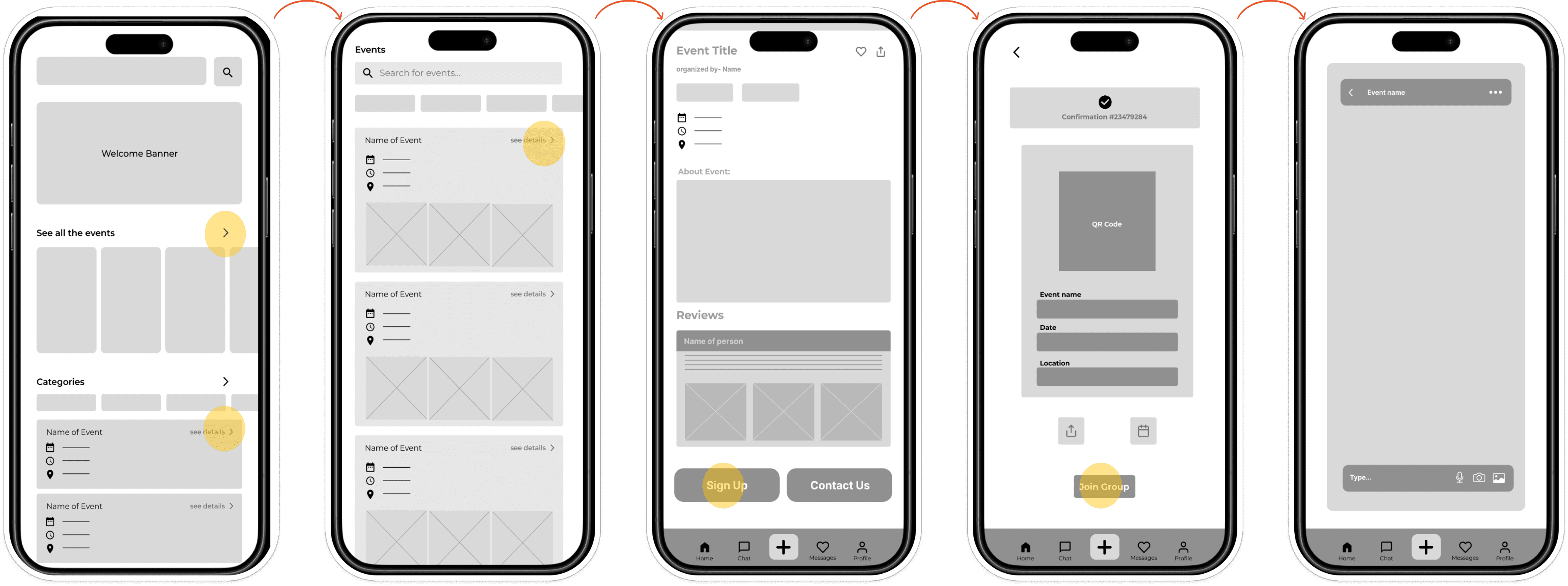
To translate abstract ideas into tangible forms, we began with quick sketches to explore multiple layouts and interaction possibilities. These sketches served as a low-cost way to compare alternatives and spark team discussions. From there, we created low-fidelity prototypes that focused on structure and flow rather than visuals. This allowed us to validate the Happy Flow and To-Be Journey Map with users and teammates early, refining core features before investing in high-fidelity design.
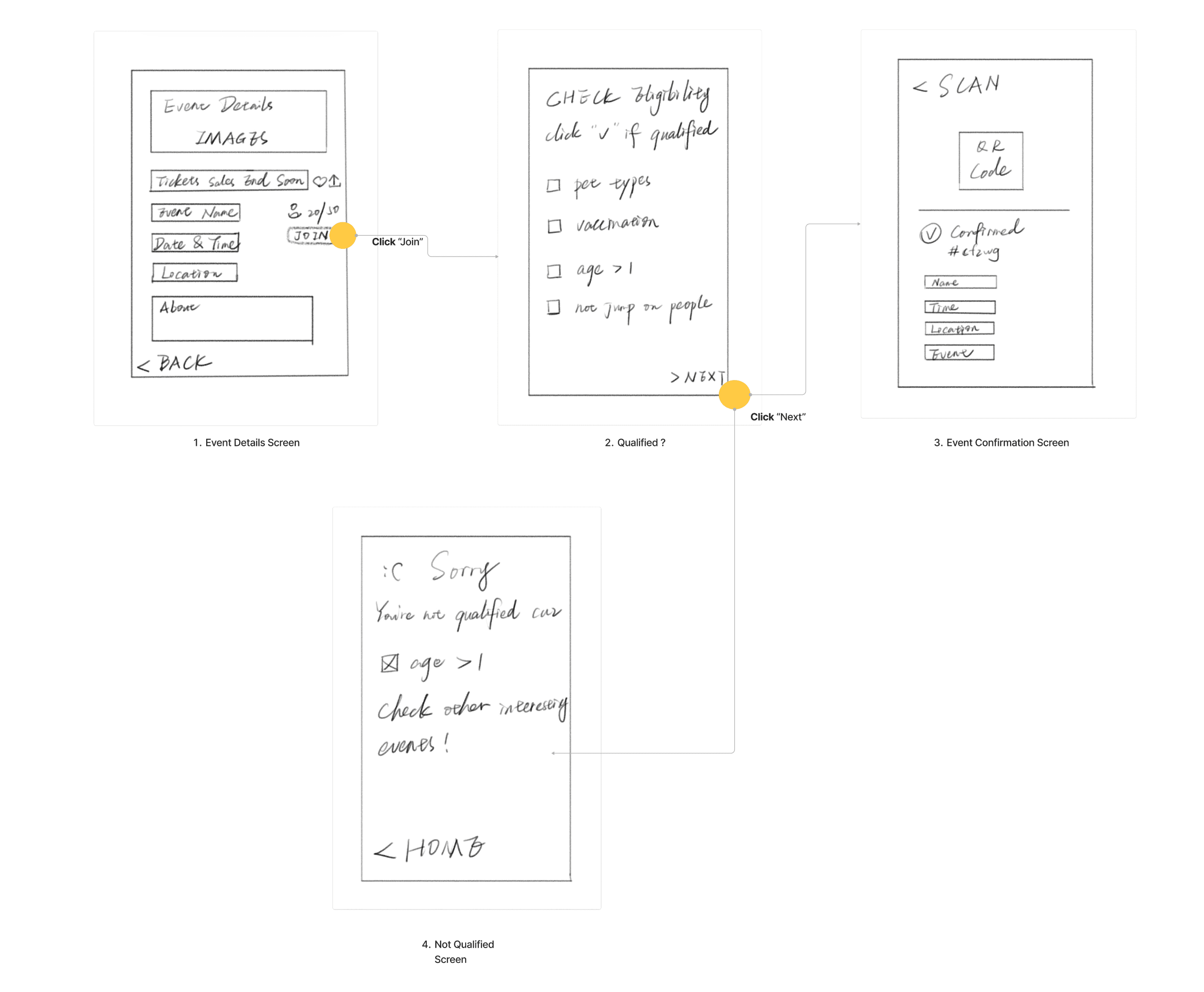
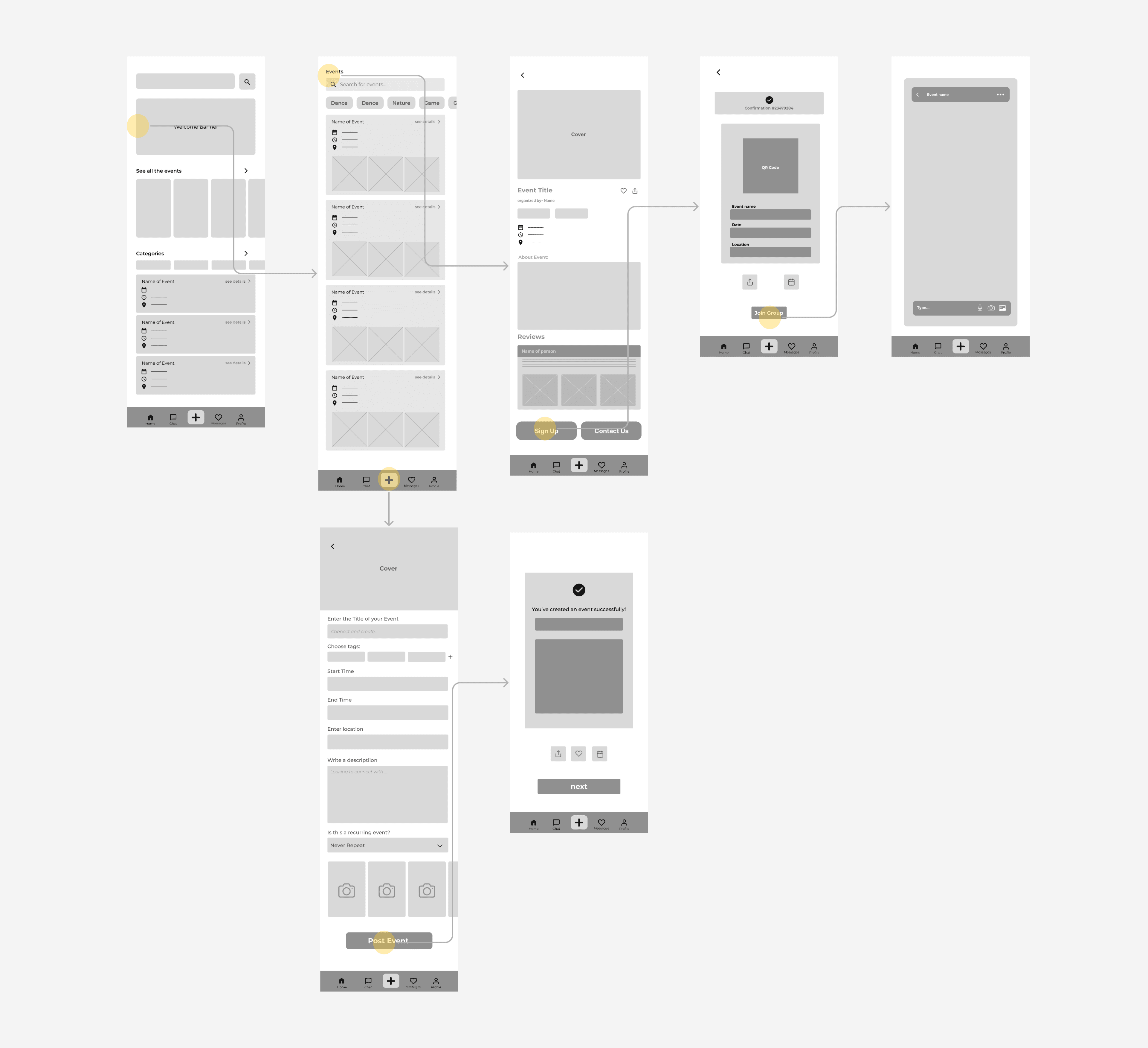
Low Fidelity Wireframes and Prototypes
Test & Iteration
Making Design Work for People
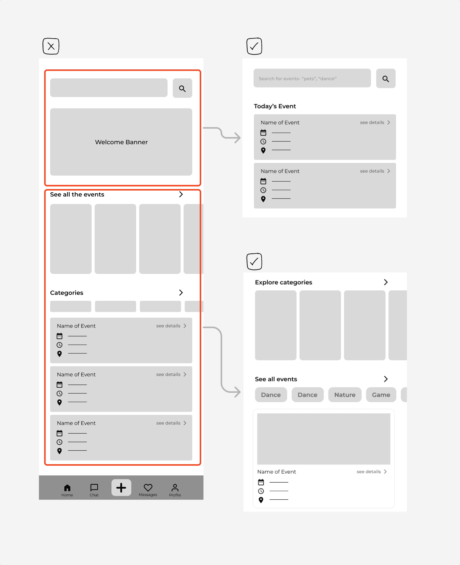
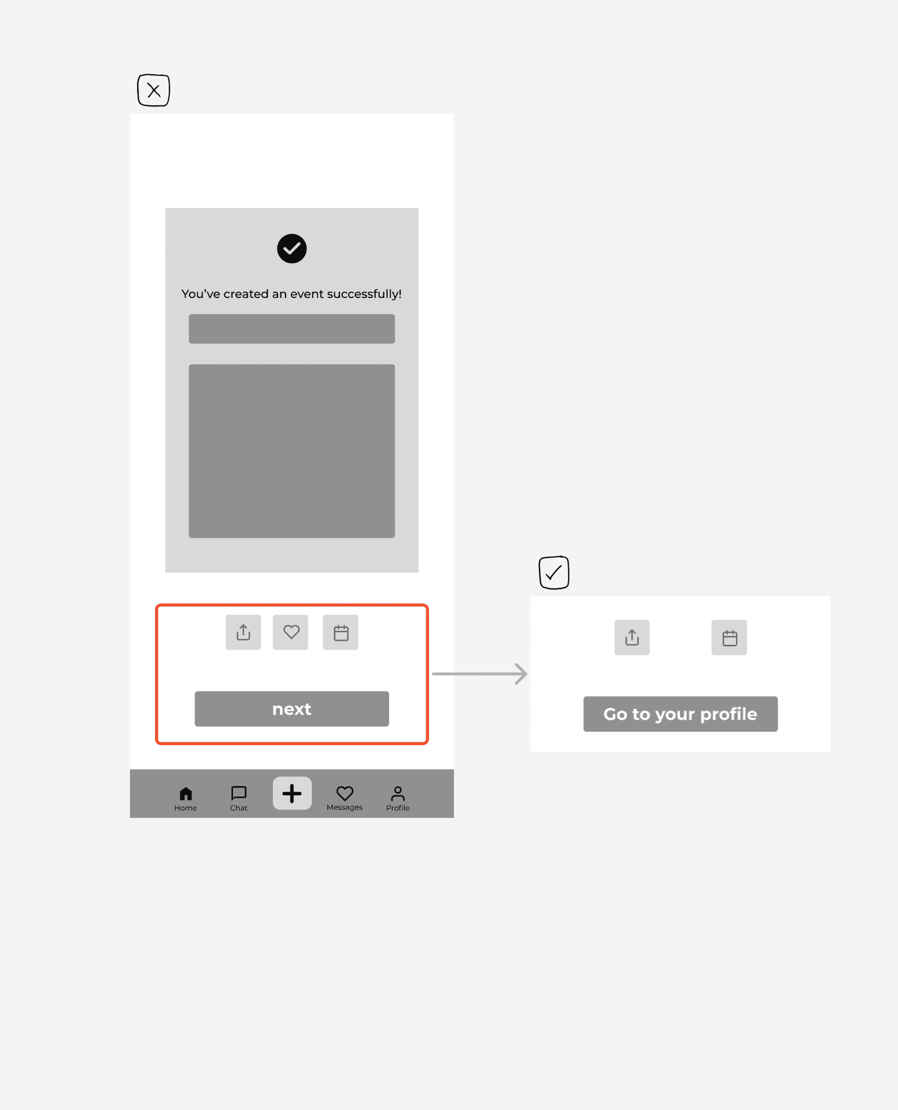
Testing with real users reminded us that design only matters if it can be applied in everyday life. We ran 10+ usability tests with students, focusing on core tasks like discovering events and joining groups. These sessions revealed where navigation felt confusing or steps were unclear. By iterating after each round, we turned abstract concepts into actionable improvements, ensuring the final design felt intuitive, supportive, and ready to meet real needs.
Usability Tests
UI Style
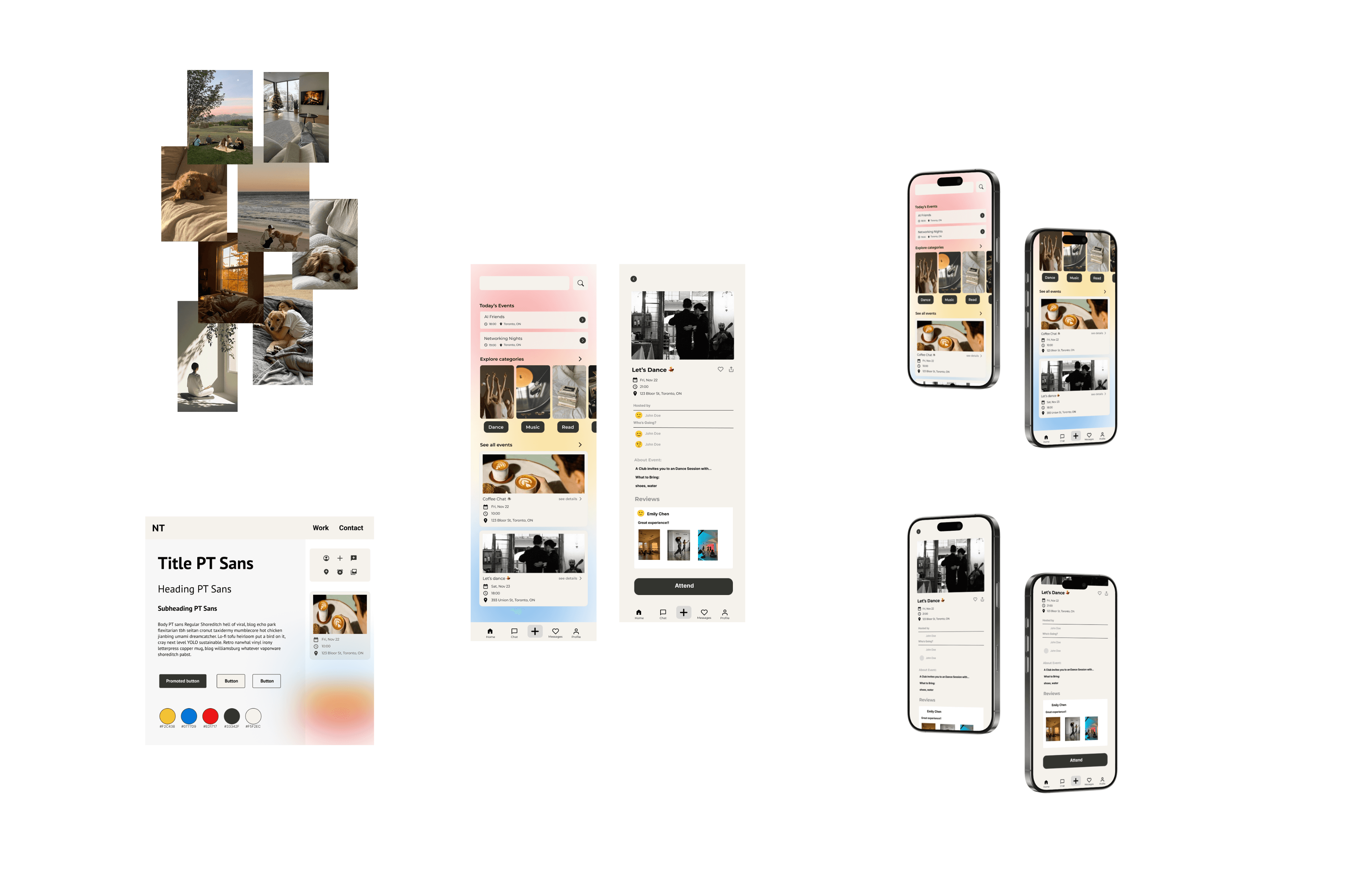
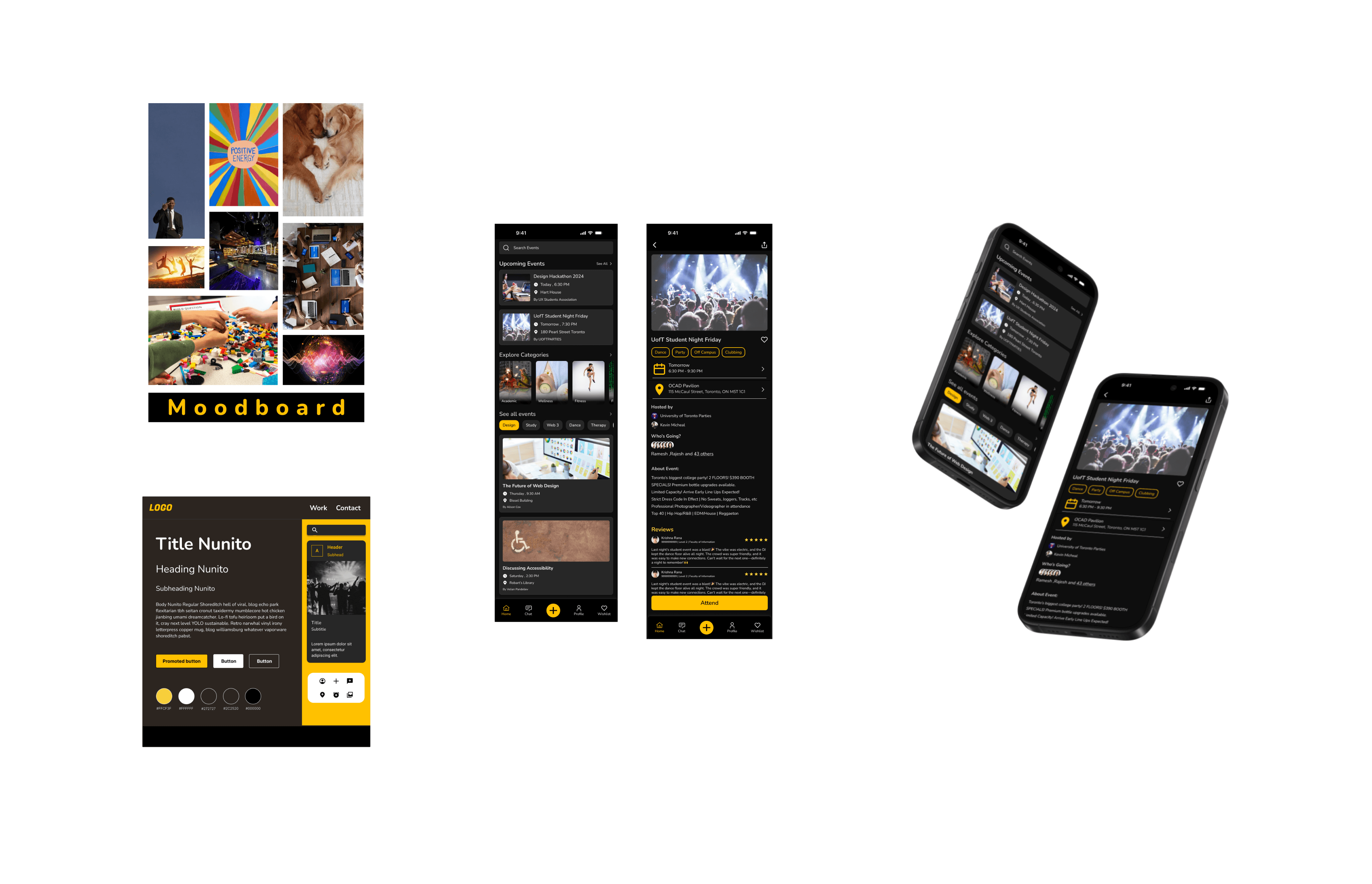
Refining the Visual Identity
We established the final UI style through moodboards and style tiles, aligning colors, typography, and imagery with the app’s goal of fostering belonging. This process ensured visual consistency across screens and translated abstract design principles into a cohesive, welcoming interface.
Personal Work
Final Team Desicion
Prototype view
Three Key Features Display

Attending an Event
This flow illustrates how users can easily discover and join campus events through the app.
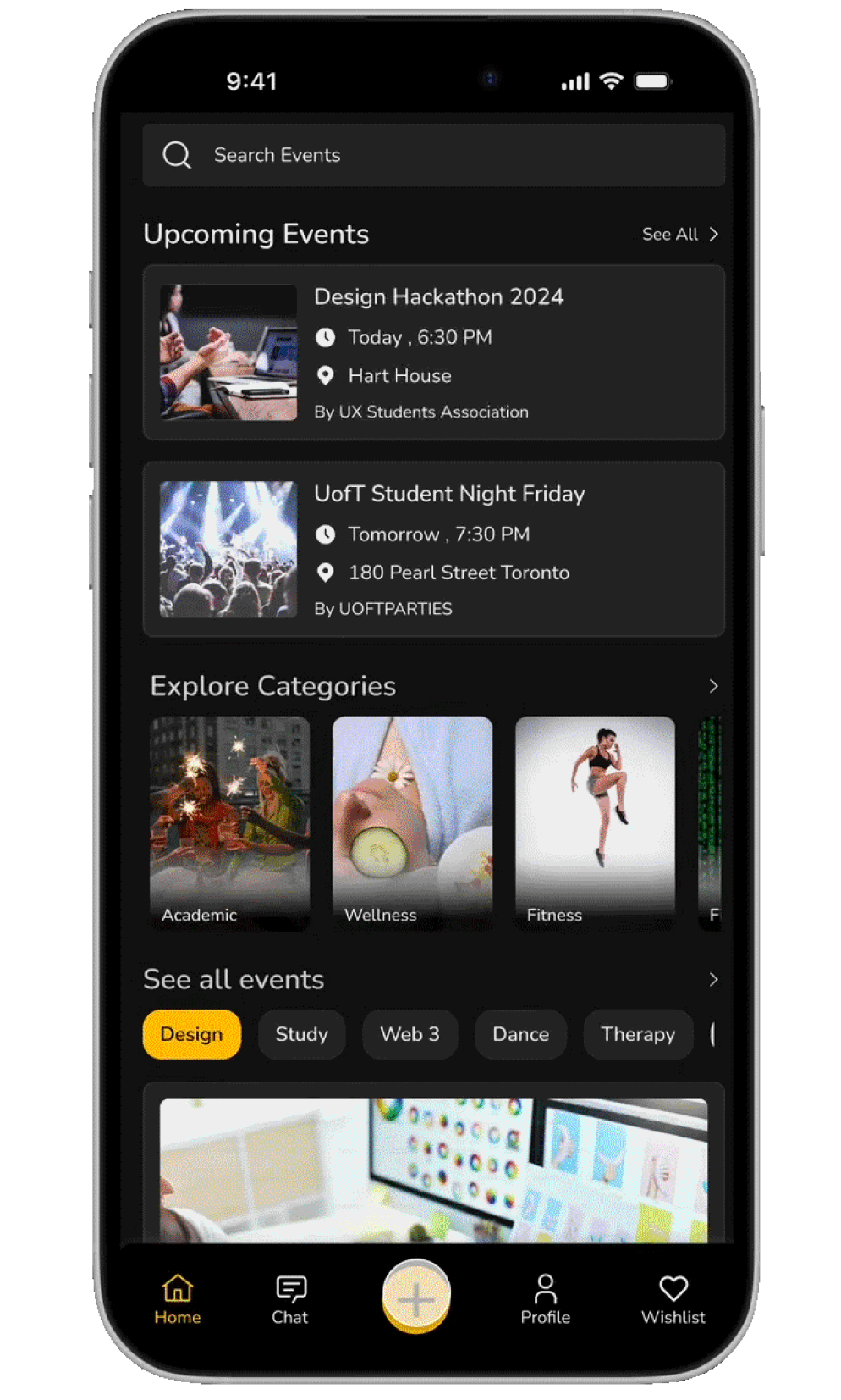
Home Page – User browses upcoming events and categories, then selects an event of interest.
Event Details Page – User views event information, host details, and attendee reviews before deciding to attend.
Details Confirmation – User confirms his/her personal information and event details.
Booking Confirmation – A QR code is generated for entry, with options to share, add to calendar, or join related group chat.
Joining the Group
This flow shows how users can connect with peers through the app’s group chat feature:
Booking Confirmation – After registering for an event, user selects Join Group to connect with fellow attendees.
Group Chat Page – User enters the dedicated chat space, where participants can exchange messages and build connections before the event.
Group Chat Information Page – User views group details and sees the list of members attending, fostering a sense of community and belonging.

Creating an Event
This flow demonstrates how users can set up their own event and manage it within the app:
Home Page – User navigates to the option for creating a new event.
Create an Event Page – User fills in details such as event name, time, location, and description, then uploads relevant images.
Event Created Confirmation Page – Once posted, a confirmation with a QR code is generated for easy sharing and participant check-in.
My Events & Connections Page – User can view their event alongside others they has joined, monitor attendees, and manage their connections.
Reflection
What I Learned
This was my very first team project as I began learning UX/UI design. Looking back, it feels simple, even a little raw, but that’s what makes it meaningful. It marked the beginning of a journey I know will be full of both clarity and confusion.
Learning by Doing
Every phase, from brainstorming to prototypes, taught me not just what to design, but how to think like a designer. Recording each step of the process helped me see the logic behind decisions and the value of iteration.
Constant Reflection
-No One Starts as a Pro
With each look, there’s something to sharpen: clearer IA, better-placed nav buttons, tighter wording. I’m keeping those early missteps in this case study to honestly document my growth.
A Reminder for the Road Ahead
I know there will be times in my career when I feel uncertain or stuck. When that happens, I want this case study to remind me of where I started: with curiosity, patience, and the willingness to try.
If you’re looking at this, I hope it also brings back memories of your own first project. No matter how small or imperfect it seemed, it was a footprint on your path. And every footprint counts.👣
©Elsie Dong